Designing a Connected Mobility Experience
Ticketing + In-Transit Food Ordering for Fragmented Bus Operations

THE CHALLENGE
Timeline
2025
12 weeks
Workflow
Research interview
Synthesis
Design
Usability testing
Product
City application
Team
Olivier André (Lead designer)
BUSINESS PROBLEM
Context & Business Problem
Public transport apps are high-frequency, low-margin products. Riders open the app 10–14 times a week, but each transaction earns cents. The business goal was clear: monetize attention without taxing the core flow.
BUSINESS CONSTRAINTS
A commuter's journey has predictable dead time (waiting at a stop, riding 20 minutes) and a predictable path. If we know where someone will be and when, we can let them order coffee or food that's ready exactly when they pass by.
Constraints I had to design within
The ticket flow is sacred. Any added friction there kills retention.
Design for uncertainty
Food vendors are third parties with variable prep times.
Pickup logistics are unforgiving — a bus doesn't wait for a latte.
RESEARCH INSIGHT
Insight 1 — Commutes are rituals, not journeys. 81% of surveyed riders take the same route at the same time daily. They don't need discovery so much as repetition: "my usual coffee, at my usual stop." → This pushed me toward a reorder-first design rather than a browse-first marketplace.

Commutes are rituals, not journeys. 81% of surveyed riders take the same route at the same time daily.
Insight 2 — Anxiety beats appetite. In interviews, the #1 reason people don't order ahead today: fear of mistiming. "What if my bus is early?" "What if the food isn't ready and I miss my connection?" → Timing confidence became the hero of the experience, not the food catalog.

Commutes are rituals, not journeys. 81% of surveyed riders take the same route at the same time daily.
Insight 3 — The stop is a better address than the store. Riders think in stops, not street addresses. "Pick up at Rose Hill Central, platform 2" is instantly meaningful; "collect at 14 Avenue des Manguiers" is not. → I made the transit network itself the geography of the food experience.

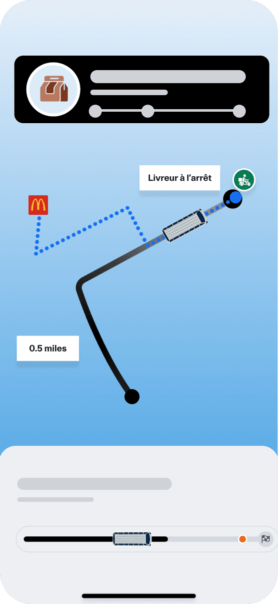
Insight 4 — Two distinct moments of intent. Orders happen either before leaving (planned: breakfast, lunch pickup) or mid-ride (impulsive: "20 minutes to go, I could eat"). → The entry points and defaults differ for each; one flow can't serve both.
DECISION 1:
Food is a layer on the journey, not a second app
I rejected the obvious pattern — a bottom-tab "Food" section like a mini Uber Eats — after testing a quick prototype. Users described it as "two apps stapled together," and it created a discovery problem (out of sight, out of mind) while still cluttering navigation.
Instead, food lives inside the journey context:
On the trip screen, eligible stops along your route show a subtle "order here" affordance.
On the live ride view, a contextual card appears: "Arriving at Curepipe in 22 min — coffee ready when you get there?"
A lightweight Food tab exists for planned orders, but it opens pre-filtered to your routes and your usual stops.
DECISION 2:
Decision 2: Time is the primary unit, not distance
Every vendor card answers one question first: "Will it be ready when I am?" Vendors are sorted and badged by pickup feasibility (✓ Ready before your arrival), computed from live vehicle position + vendor prep time + a safety buffer. Items that can't make it in time are visible but clearly marked — never silently hidden, never falsely promised.


DECISION 3:
Decision 3: The ticket flow gains zero steps
Food entry points are strictly additive surfaces (cards, affordances on existing screens). The ticket purchase path — home → route → pay → Scannable ticket — is byte-for-byte identical to before. I held this as a non-negotiable and verified it with funnel analytics post-launch.


Testing & Iteration
Testing & Iteration
5 rounds of usability testing (8 participants each) across lo-fi → hi-fi.
Biggest pivot: v1 put a full restaurant-style menu in the mid-ride flow. Completion rates were poor — people on a moving bus don't browse, they grab. v2 cut the mid-ride menu to 6 curated items + reorder, completion jumped from 41% → 83% in testing.
Second pivot: my original pickup screen led with the order code. Field testing revealed the real first question at arrival is "where do I walk?" — so wayfinding now leads, code follows.
A/B in pilot: contextual ride-view card vs. push notification as the impulse entry point. The in-app card won on conversion (3.1×) and, critically, generated zero opt-outs versus notification fatigue.
(12-week pilot, 2 cities, 46 vendors)
Cityflow synced food orders to transit arrivals, turning the commute into a natural ordering moment. It became a habit fast: by week 12, 64% of orders were reorders, 18% of weekly riders had ordered food, and 92% of first pickups needed zero support. Revenue covered operating costs by week 9 — with no impact on the core ticket funnel.
18% of weekly active riders placed ≥1 food order
$7.40 average order value; food revenue covered the pilot's operating cost by week 9
64% of orders were reorders by week 12 — validating the ritual/repetition insight
92% successful first-attempt pickups (order ready & collected without support contact)
Ticket funnel unharmed: purchase completion time and conversion flat vs. control cohort
App Store rating moved from 4.2 → 4.5 in pilot cities
What I Learned
The strongest monetization design is invisible to the people who don't want it. Protecting the core job earned the trust that made the upsell work.
Confidence is a feature. We sold timing certainty more than we sold food. The synchronized timeline did more for conversion than any menu improvement.
Design the bad day first. In a system with buses, kitchens, and humans, the failure flows are the product. I'd start there even earlier next time.
If I had another quarter: group ordering for regular co-commuters, vendor-side tooling for surge prep at peak times, and loyalty mechanics tied to commute streaks.